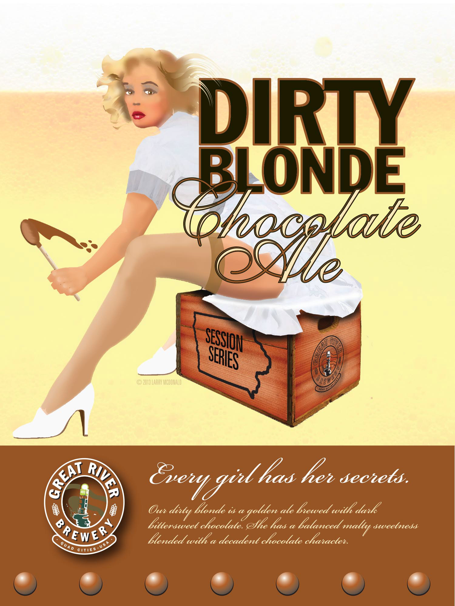
"Try this," the Brewmaster said, " it has a surprise." The brew was light and I expected a saison, but no... chocolate! The Brewmaster elaborated, "People expect chocolate beers to be dark and heavy, but this one is light. We're going to call it Dirty Blonde."
This is the short version of how the package and the girl came to market.

Craft brewers have an insane attachment to a name once they've coined it, so I knew that was locked in, naturally they wanted a girl. Somebody said, "50s blonde," I thought a period travel poster with big areas of flat silkscreen would be a distinctive look. I sketched this out.
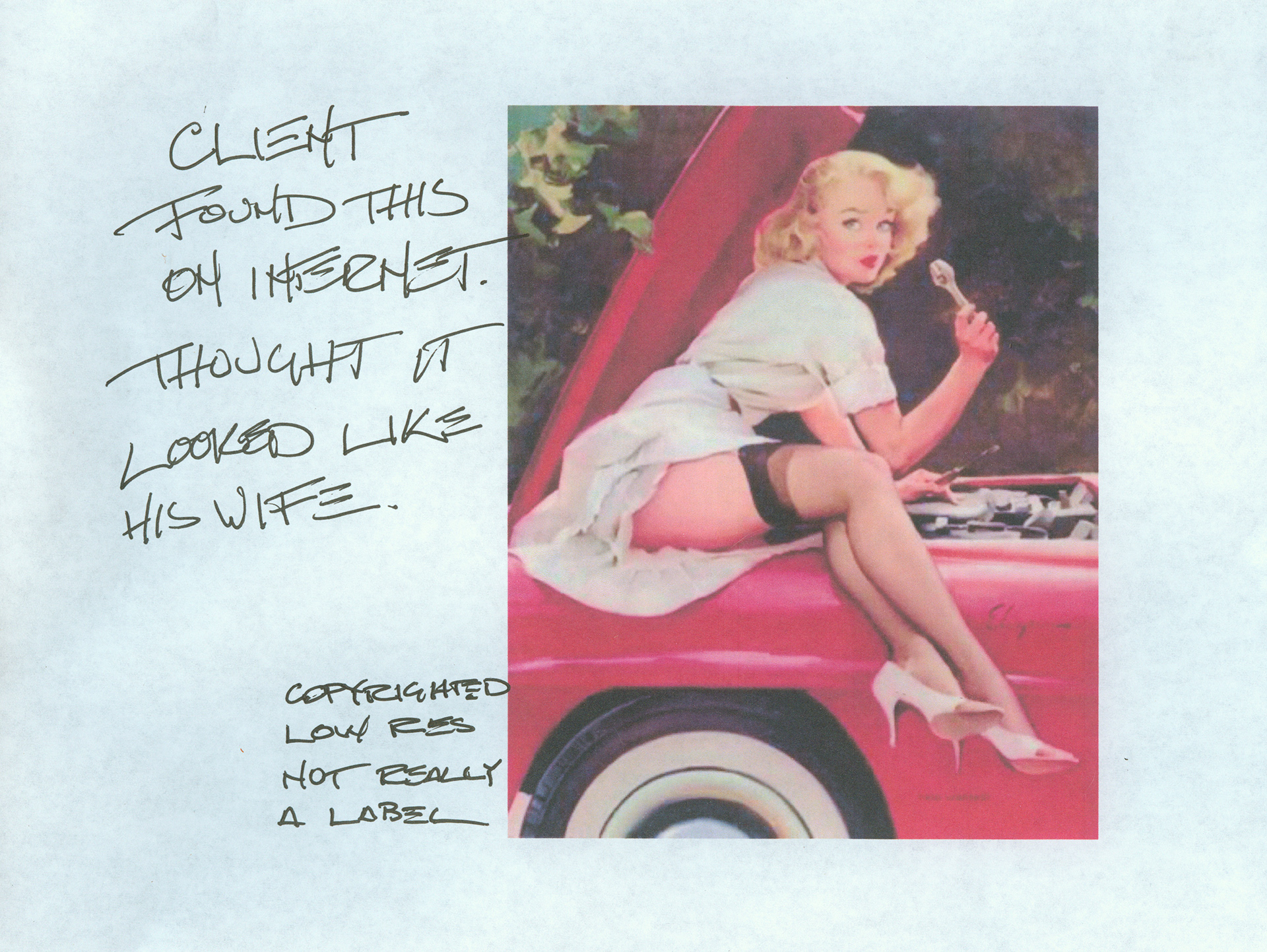
Distinctive was not to be the order of the day. Rather the Management Team handed me this with instructions that that's what they wanted the label to be.
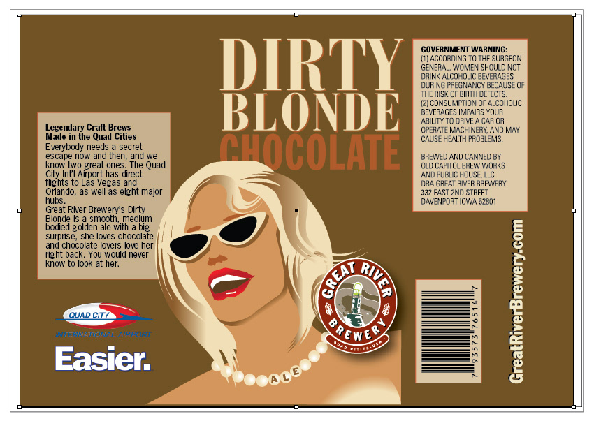
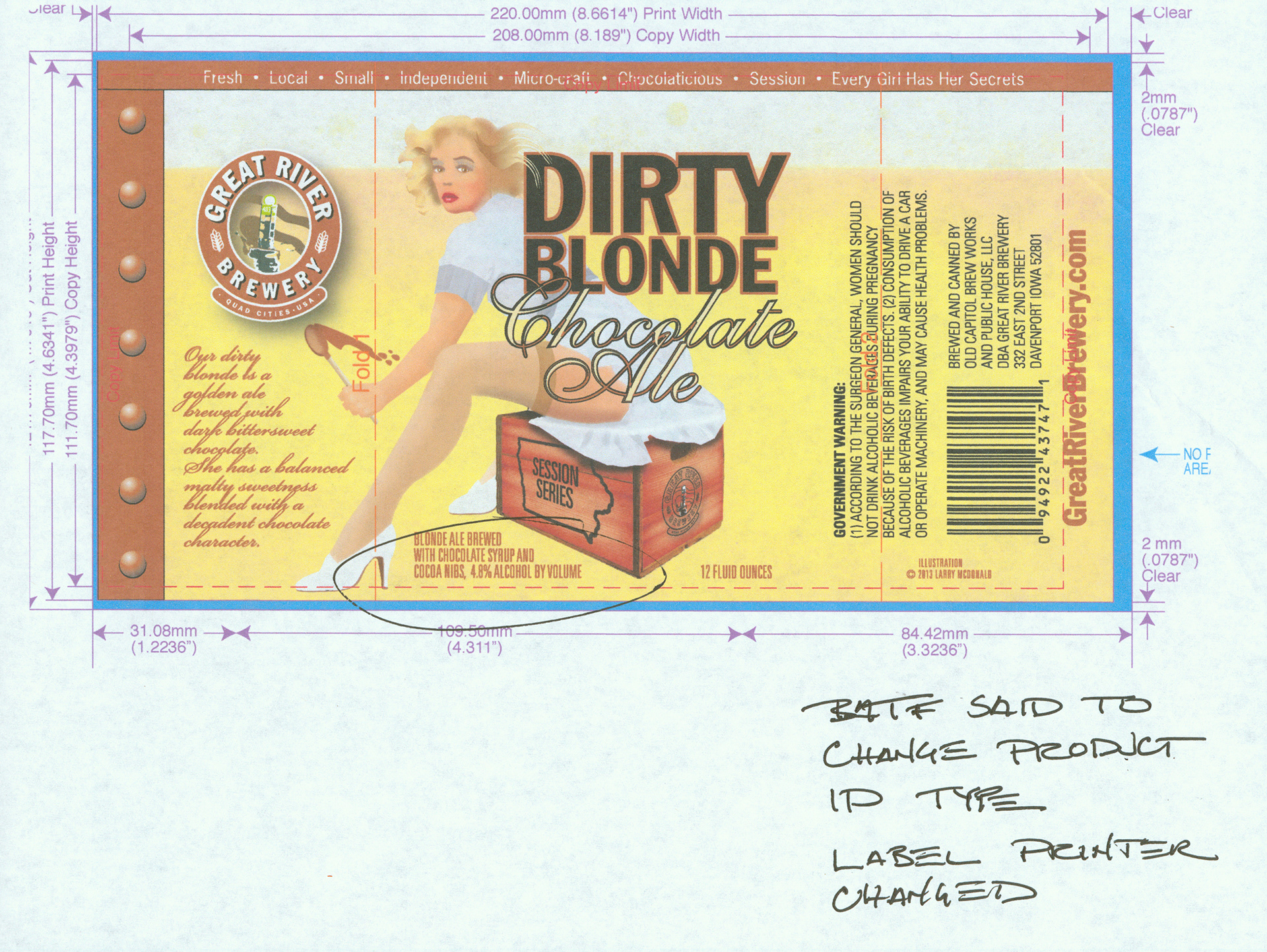
Retail labels have a lot going on in terms of product ID and trade dress and not much real estate. Here I drew vector elements of the girl so I could easily move her around. BATF mandated type sizes are fitted into the label manufacturer's specifications.
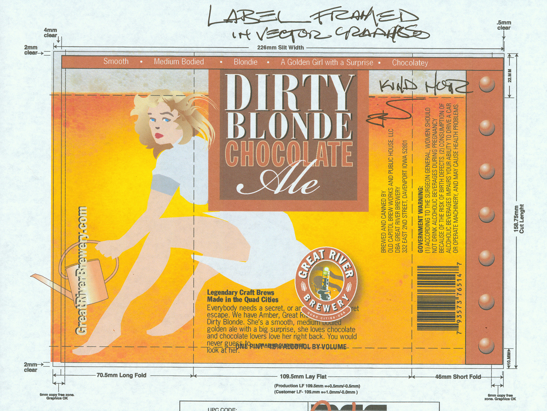
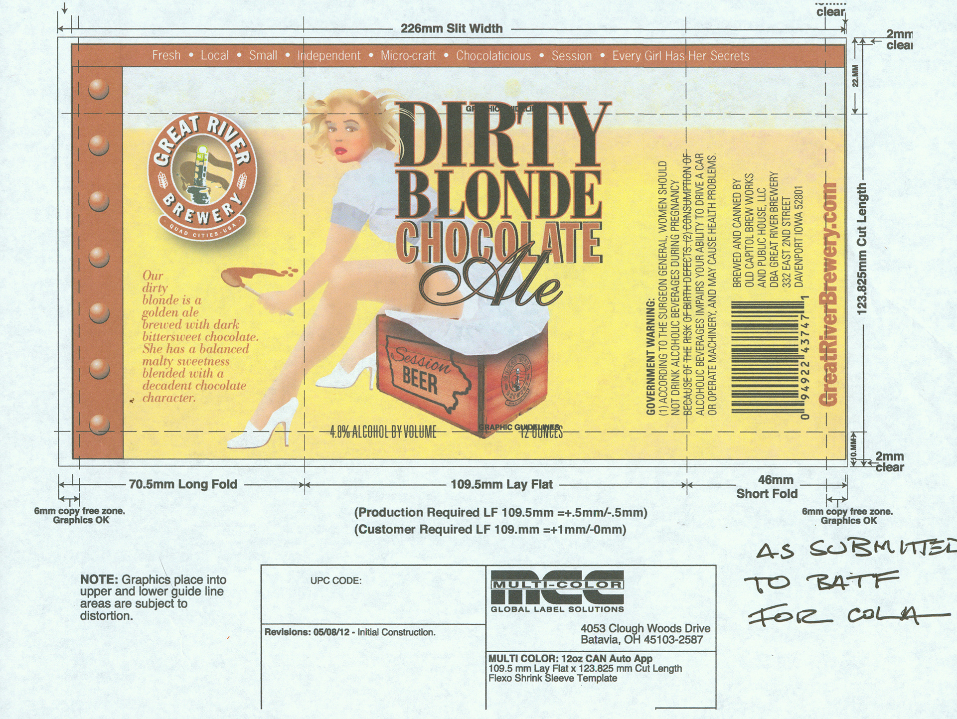
The product was scaled from a 16 ounce package to a 12 ounce package.
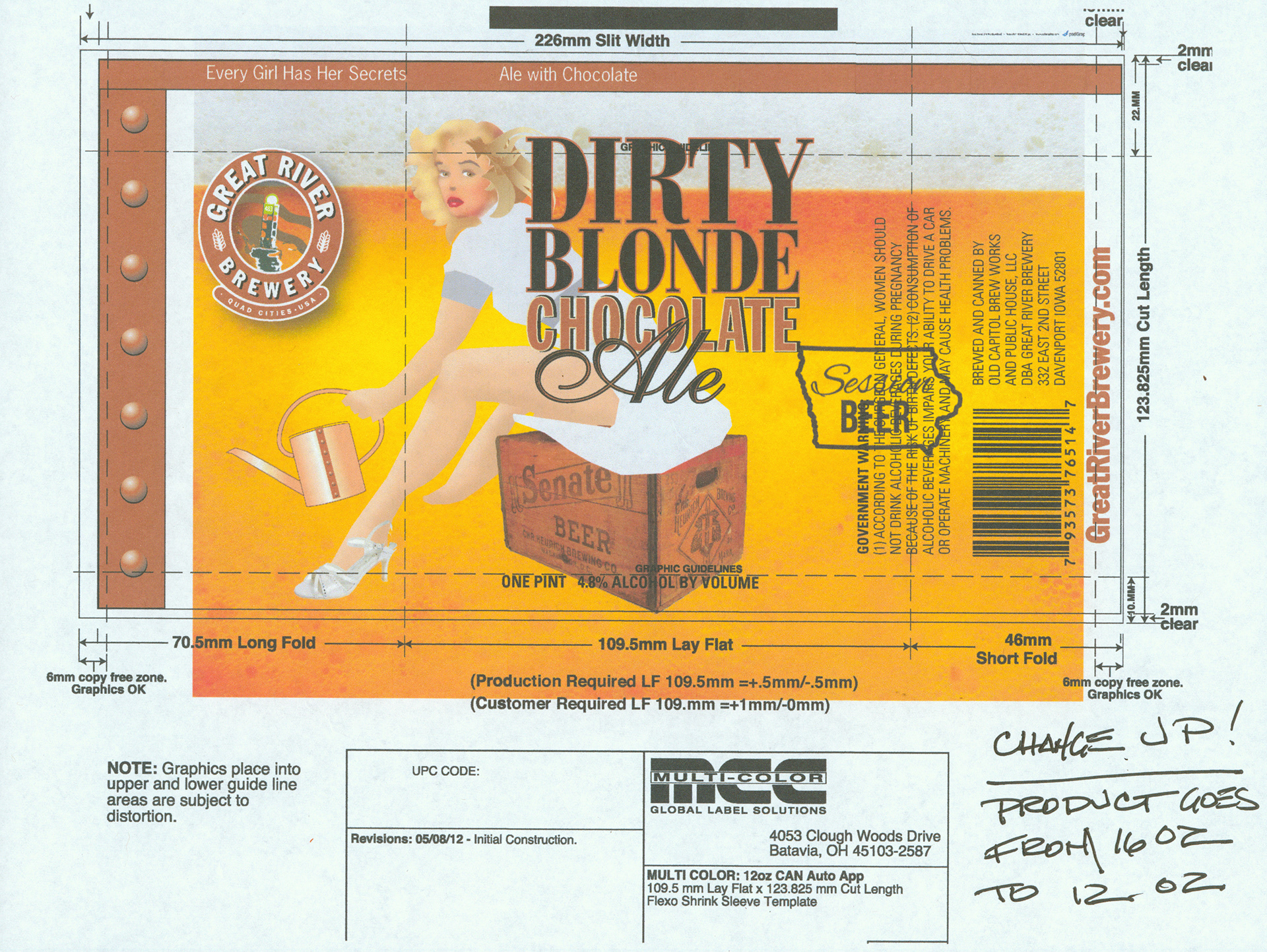
The Bureau of Alcohol, Tobacco and Firearms has strict requirements for labels, such as wording, type size and things they just thought of that morning. In the approval process, the BATF determined the product name needed to be represented as adjective/ adjective/ noun/ noun, rather than adjective/ adjective/ adjective/ noun

All the technics and legality of the package aside, i always intended the Dirty Blonde to be a bit salacious and scandalous, a nice girl caught doing something naughty. As for her secret, you only have to look into her eyes.